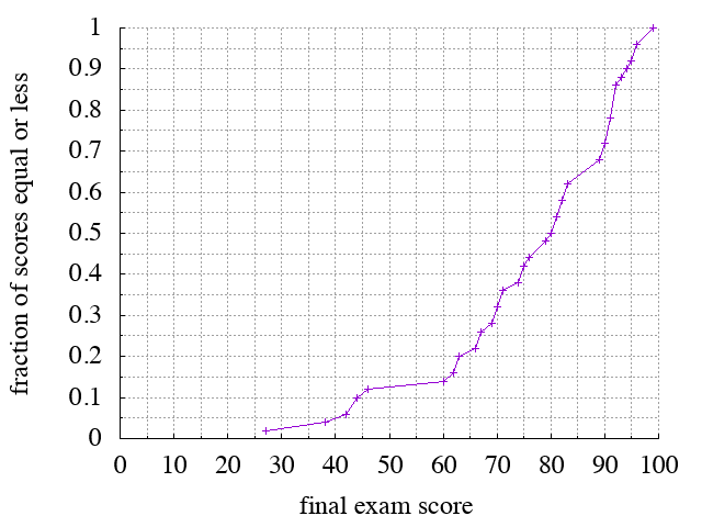
Below are the class's exam scores on the final, depicted as a cumulative distribution function (or CDF). CDFs contain a lot of information (all of the information about a distribution in fact), but they take practice to learn to read. We had an opportunity on the midterm; here's another one.
A CDF, by definition, maps a given x value (in this case a score) to a fraction. That fraction represents the fraction of scores in the distribution that are lower than the given x value. (Technically, what's depicted is not a true CDF because for discrete data, the CDF should be a step function. But this is close enough and probably easier visually.) For example, x=80 maps to y=50, so if you got a 80/100, then you scored equal to or higher than 50% of the class.
In other words, this graph maps scores to percentiles. This kind of graph also allows you map from percentiles back to scores: start at a given percentile (y-value), and look for the corresponding x-value.
And you can read out clusters. For example, the long gap with no crosses between 46 and 60 means that no one scored in that range. Likewise for the range 83–89.
For bottom-line statistics: the mean was 75.9, the median 80 (as noted above), the mode 91, the standard deviation 17.2, and the highest score 99.